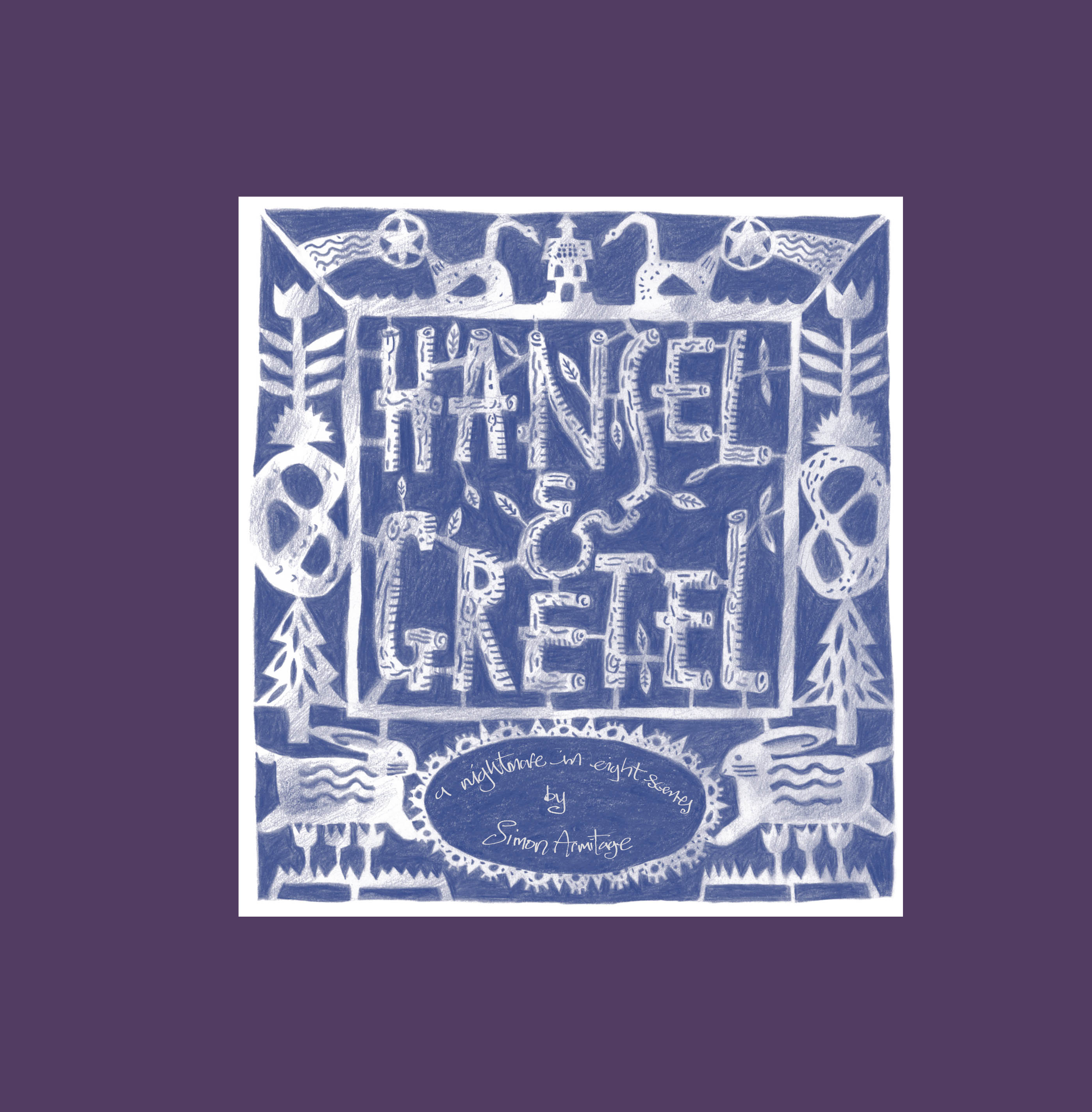
It is not everyday that you get a chance to work with poet laureate, Simon Armitage and distinguished artist, Clive-Hicks Jenkins. When Joe Pearson of Design for Today told me about a special project involving both of them and asked if I was interested I naturally jumped at the chance. I have worked with Joe on a number of projects, ranging from concertina fold-out books, to fully illustrated children’s books and more. The new project was to be a re-telling by Simon Armitage of the Fairy tale of Hansel and Gretel written originally by The Brothers Grimm. It was to be illustrated using a variety of techniques by Clive Hicks-Jenkins.
I work as a graphic designer but I am also a typographer and finished art worker. Finished art working in its most simple form is taking existing artwork and making it print ready. In Clive’s case, the artwork was done either as pencil on paper or graphite pen on a transparent and textured paper. Here is an example of a pencil on paper drawing of Hansel and Gretel by Clive.
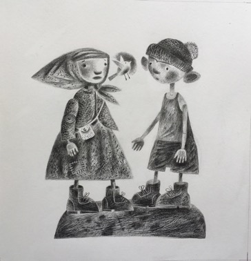
I wanted to keep as much of the very subtle lines and textures as possible but had to remove the tone and colour of the background paper first.

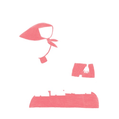
This is a very time-consuming process. It requires me to scan and enlarge the image on the computer. I then had to paint out the paper and background by hand using Photoshop. Clive also supplied the overlay which was to be printed as a second colour layer. For this layer I applied the same process. For this particular image there was just the one additional colour, red. Below is the red layer on its own, then overlaid on top of the main pencil image and it is then set to multiply in photoshop which enables it to blend in with the base image.
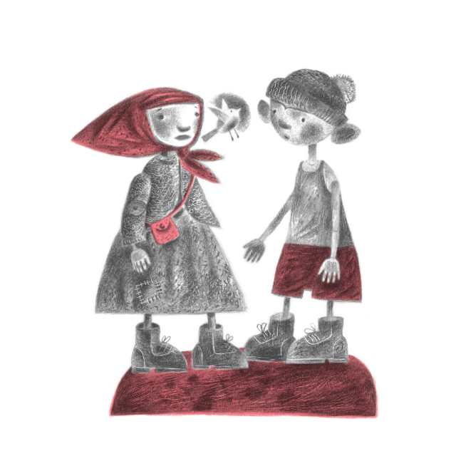
This is the final printed effect. You can see that some of the registration marks are not perfectly aligned, but that was all an intended part of the look, so that it had a hand-crafted quality.
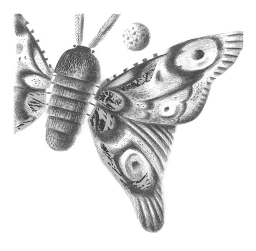
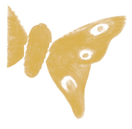
Here is an image with more than one layer. The butterfly has three layers this time, black line, yellow and blue. They all mix together and thus another greenish colour is made in the wings.

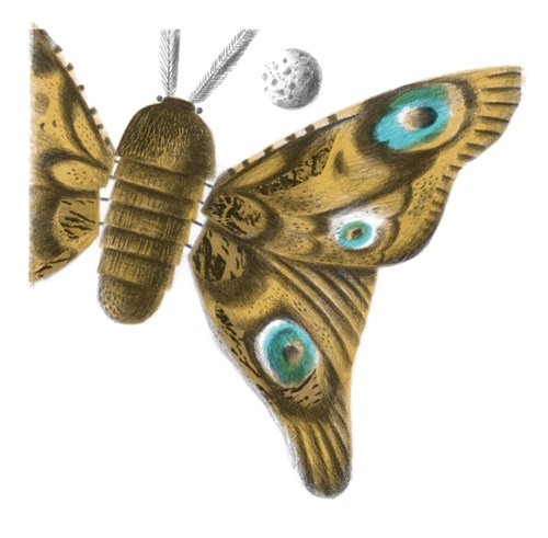
This part of the process is one of the most satisfying. After long hours of careful and patient paper tone / colour removal I added the right colour(s) as chosen by the artist, to see them come together is very exciting.
Clive Hicks-Jenkins and the publisher, Joe Pearson, developed the dummy for the book over an intensive two days at Clive’s studio in Wales, and my role was to join the team in translating the 'cut and paste' dummy into the finished book. I was able to experiment with colour, type, and to refine the initial layout. At each stage of the design process feedback from the artist, author and publisher played a key part in shaping the final book, a true team production.
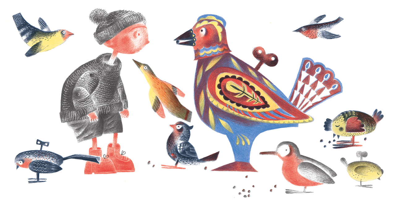
We wanted the story to come alive on the pages. We had some fun playing around with the positioning and size of the text. Below is an example of one of the spreads.

Some images took longer to finesse than others. This centre spread was no exception. It was one of the first images I worked on but I’m happy with how it turned out. This particular spread went through a few colour variations but here’s how it ended up.
Using this method gives great control over the colours. They can be boosted and adjusted. One method I used was to double up on a colour if I wanted it to appear brighter/stronger. That can be seen in the red in this image. I have dissected the variants and layers of the colours so that you see what I mean.
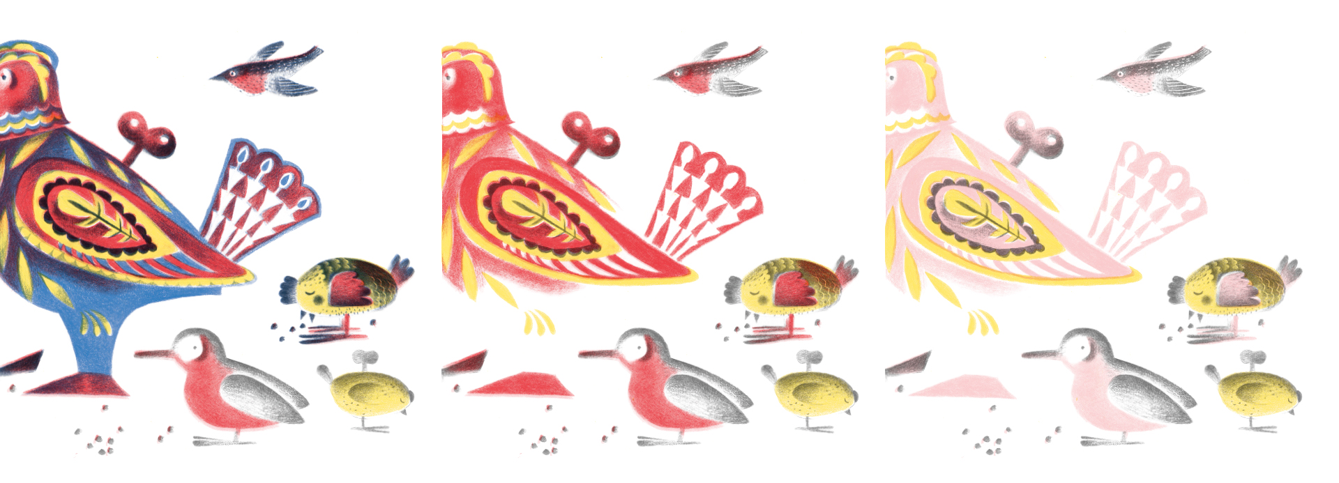
The pinkish red on the far right is just the red layer duplicated and set to around 30% or so of opacity. Clive Hicks Jenkins has an excellent brain for understanding colour separations. I’m still not sure how he worked out all the various tones in just black.
I apologise if some of this seems too technical. I will of course be happy to answer any questions if anyone has any. The book took a few months or so of work and was finally published last year. I’m happy to also share that it’s just been shortlisted for the V&A 2020 Illustration Award.
If you are interested in purchasing a copy, Design For Today has resumed shipping and you can order it from the website here.
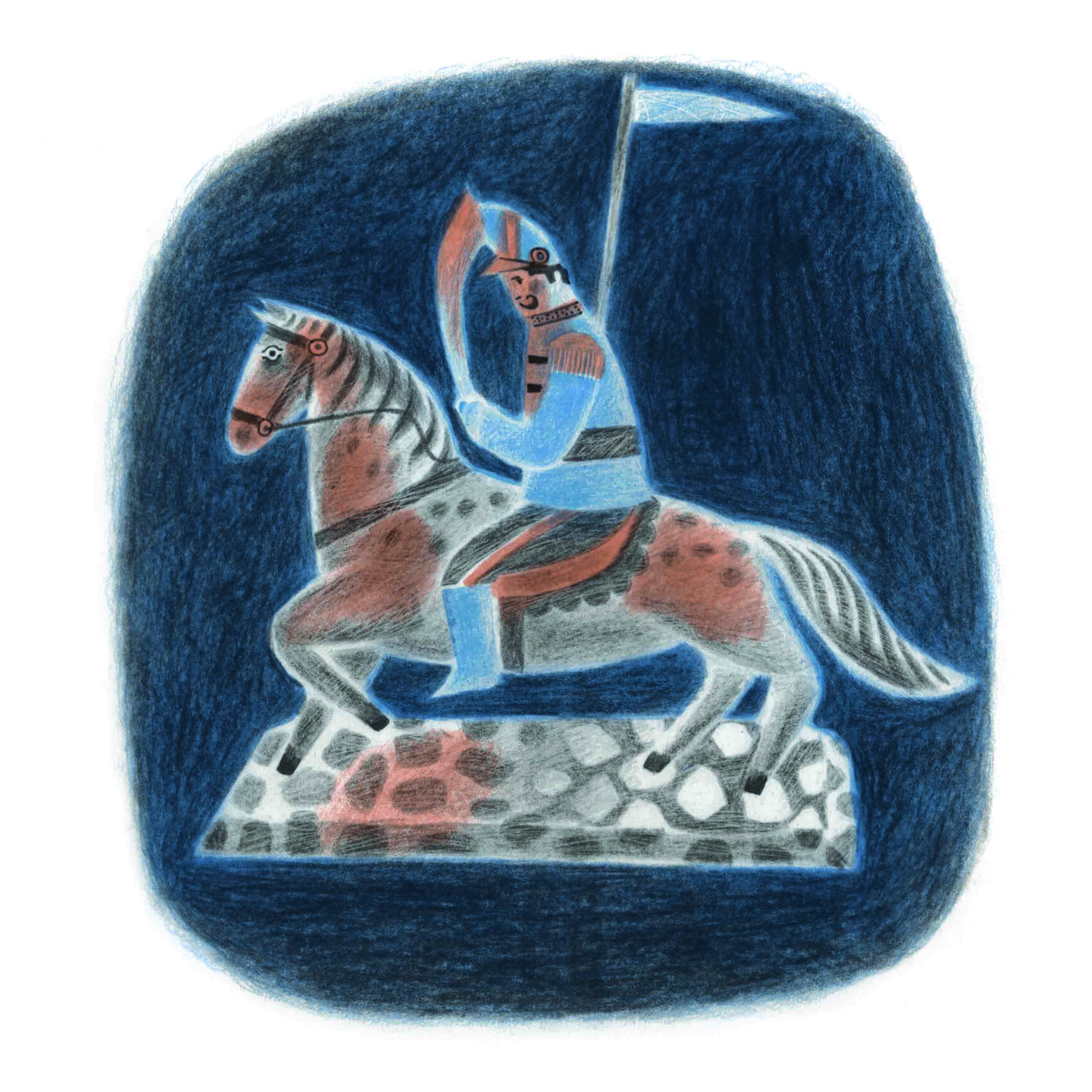
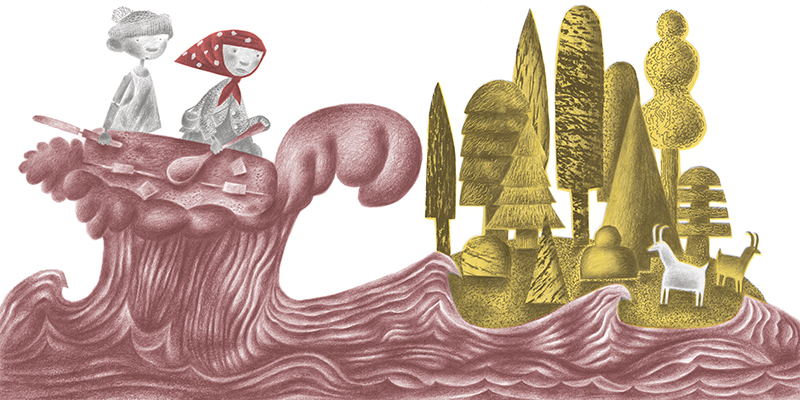
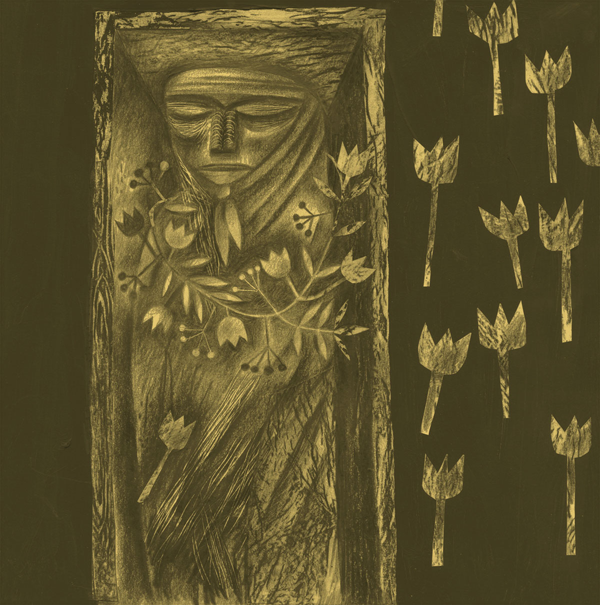
I’ll leave you with a few more images from the book.